

Desktop, tablet and mobile
Every page can be laid out separately for each screen size, so your site looks right on a laptop, a tablet and a phone.
Switch device mode
Use the bar under the canvas: Desktop · 1200px, Tablet, Mobile · 375px. Changes you make apply to the mode you're in.
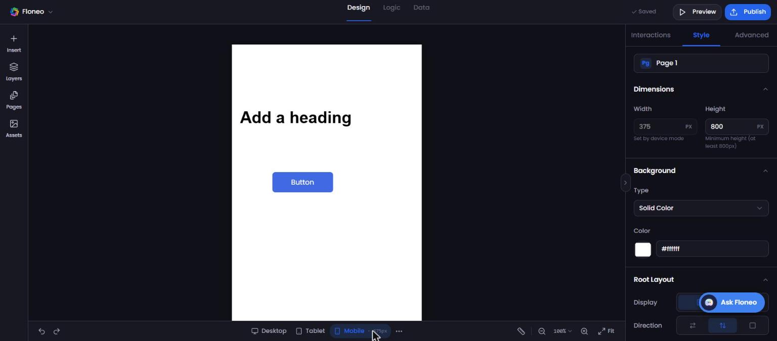
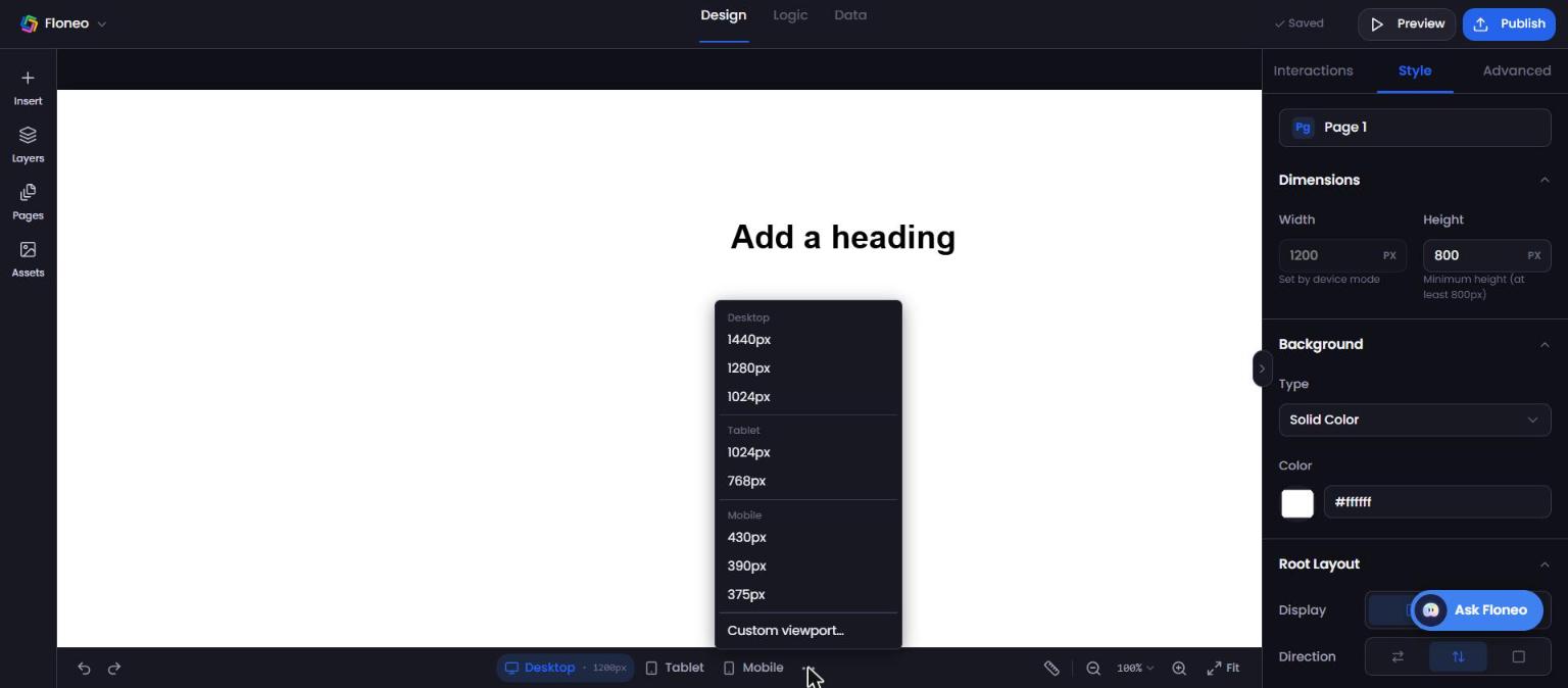
Click ⋯ for more preset widths:
| Device | Widths |
|---|---|
| Desktop | 1440px, 1280px, 1024px |
| Tablet | 1024px, 768px |
| Mobile | 430px, 390px, 375px |
| Custom | Custom viewport… — any width |
Make new elements appear on every size
With nothing selected, open Style (page settings):
- Sync Across — copies new elements to the other device modes.
- Default Visibility — choose whether new elements show on Desktop, Tablet, Mobile. These defaults apply to new elements only.
Recommended workflow
- Design on Desktop first.
- Switch to Tablet, then Mobile, and fix anything that overlaps or is too small.
- Hide elements that don't suit small screens (Ctrl/⌘ + H or visibility settings).
- Preview and check on a real phone after publishing.
FAQ
Why can't I use the editor on my phone? Building needs a larger screen, so the editor works on screens at least 1024px wide. The apps you publish work on every device.
I changed something on desktop but mobile didn't change. That's expected — each device mode has its own layout. Switch to Mobile and adjust there, or turn on Sync Across for new elements.
How is the mobile menu chosen? When you build with AI, you pick it on the final plan screen: Slide from right, Slide from left, Drop down or Full screen.
Didn't find your answer? Contact support